Moody & Modern Backgrounds for 2026 AI Headshots: Dark Neutrals That Stand Out
Why charcoal is quietly winning, white is on its way out, and the background you pick says more about you than your job title.
I almost didn't notice it.
I was scrolling through a venture firm's "Our Team" page last month, half-distracted, half-judging the typography. Then I realized something. Every single partner had a charcoal background. Not navy. Not gray. Not the standard agency white sweep that's been the default for fifteen years.
Charcoal. Almost black. Soft, warm, expensive-looking.
That's when it clicked. The rules just changed.

If you booked a headshot in 2018, you probably stood in front of a white seamless and called it a day. If you booked one in 2022, maybe you went for that "environmental" look in a coffee shop. But 2026 is doing something different.
The center of gravity has shifted. Hard. Dark neutrals are the fastest-growing background category in corporate photography, and charcoal backgrounds add weight and authority without the dramatic edge of full black.
And here's the weird part. Most people don't even know it's happening yet.
The death of the white background (no, really)
I want to be honest with you. The bright white background isn't dying because it's bad. It's dying because it's everywhere.
When every junior associate, every recently graduated coach, and every LinkedIn ghost has the same washed-out white sweep behind them, that background stops doing any work for you. It doesn't say "premium." It doesn't say "executive." It doesn't say anything at all.
A headshot background isn't decoration. It's your first argument.
That hit me hard the first time I read it. Because it's true. Before someone reads your bio, your tagline, or your LinkedIn headline, they've already decided something about you based on what's behind your face.
White says: I followed instructions. Charcoal says: I made a choice.

What "moody and modern" actually means in 2026
Let me get specific. Because "dark background" can mean a thousand things, and most of them are wrong.
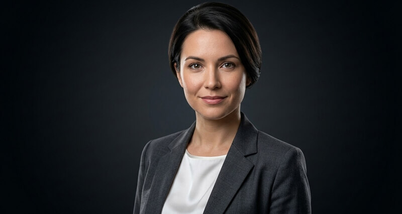
The 2026 moody headshot doesn't look like a goth band photo. It doesn't look like one of those overly-dramatic LinkedIn shots with one half of your face in shadow. It looks like a subtle, controlled, expensive frame that puts every drop of attention on your eyes.
Here's what's actually trending:
Charcoal gradients. A subtle transition from one shade to another, usually lighter at the center behind your face fading to darker at the edges. Gradients add depth and dimension that flat solid colors can't, creating a natural spotlight effect that draws the eye to your face without any visible light source.
Warm near-blacks. Not pure black (which can feel funeral-home harsh). Warm blacks with hints of brown, dark olive, or deep slate.
Soft architectural neutrals. Concrete-textured walls, dark conference room blur, the implied geometry of a high-end office without the distraction of actual furniture.
Warm off-whites and creams. Yes, light is still alive. But the bright clinical white is being replaced by softer creams, bone, and warm gray-whites that flatter skin tones across the spectrum.
The trend for 2026 is The Confident Neutral, with backgrounds leaning darker and more sophisticated. Think deep charcoals, near blacks, and warm off whites. These shades simplify the frame and put all the focus on your eyes.
This is the part nobody tells you. The reason dark backgrounds are taking over isn't aesthetic preference. It's physics. Dark neutrals reduce visual noise, raise contrast around the subject's face, and photograph beautifully across phone screens, retina displays, and tiny LinkedIn thumbnails.
Here's where it gets messy
A lot of people read "moody" and immediately overcorrect. They go too dark. Too contrasty. Too theatrical.
I've seen the result. It looks like a wanted poster.
A great moody background flatters you. A bad one swallows you whole.
The line between "executive presence" and "true crime documentary" is thinner than you think. The trick is restraint. The background should frame you, not compete with you.
Three rules I keep coming back to:
One. Your skin tone determines your shade. Lighter skin pops against deeper charcoal and warm black. Darker skin photographs gorgeously against medium charcoal, warm gray, or soft gradient slate. Going matchy-matchy (dark skin on solid black, very pale skin on stark white) usually flattens the image.
Two. Your wardrobe needs separation. Light clothing on a light background, or dark on dark, tends to blend; dark on light or light on dark keeps you clearly defined. A charcoal blazer on a charcoal background, with no rim light? You'll look like a floating head. Not the vibe.
Three. Texture beats flat. Subtle gradient or implied environmental texture always beats a flat painted backdrop. It adds depth without distraction.

The industries leading the charge (and the ones still stuck)
Not every industry is moving at the same speed. Here's the honest breakdown.
Finance, law, and consulting are leading. These are credibility industries, and dark neutrals project authority instantly. Charcoal works well for leadership and executive portraits where authority matters. If you're in private equity, BigLaw, or strategy consulting, you should already be on charcoal.
Tech and startups are split. Founder-led companies are embracing moody backgrounds because they signal "this person makes decisions." But mid-stage SaaS teams are still defaulting to white because their brand guidelines were written in 2019.
Healthcare is still mostly soft white and clinical. And honestly, that makes sense. White is standard for healthcare because trust and cleanliness are baked into the visual code. But I'm seeing more practitioners experiment with warm cream or soft sage, especially in concierge medicine and wellness practices.
Real estate, creators, and personal brands have the most freedom. This is where you can play with environmental moody backgrounds. A blurred dark library. A near-black studio with one rim light. A textured concrete wall in your office.
If you want a deeper breakdown by industry, our guide to headshot background colors that match your industry covers the specifics.
The part nobody tells you about AI headshots and dark backgrounds
Here's something I've watched happen over and over.
Someone uploads their photos to an AI headshot generator. Picks the "executive dark background" preset. Hits go. And what comes back looks... flat. Plasticky. Like the dark background is painted on instead of lit.
This is where most generators fall apart. Because creating a moody headshot isn't just about putting a dark color behind a face. It's about light separation. The rim light on the shoulders. The catch light in the eyes. The subtle gradient that prevents the head from looking pasted on.
Cheap generators skip all of this. They give you a face on a dark rectangle.
Good generators (and yes, I'm biased here) actually model the lighting scenario. They render proper edge separation. They give your hair a subtle highlight against the dark background so you don't look like a cutout. In 2026, executives and their communications teams are specifically requesting that retouching preserve natural skin texture, age-appropriate features, and genuine expression, avoiding the plastic appearance that heavy retouching produces and that audiences across generations have learned to distrust.
Stay with me here, because this is the bit that actually matters.
If you're going to invest in moody backgrounds for 2026, you need to either:
- Hire a real photographer who knows how to light dark sets (expensive, slow, and you only get one session)
- Use an AI tool that renders lighting properly, not one that slaps a black filter behind you
That's it. There's no third option that produces good work.

Quick CTA: try it before you commit
If you've never seen yourself in a moody background, the easiest way to test it is to actually generate a few. Upload some photos, pick a charcoal or warm-black preset, and see how your face reads in that frame. You'll know in thirty seconds whether it works for your features.
We built HeadshotPhoto.io specifically for this kind of fast iteration. You're not committed to one look. Generate ten variations. Pick the two that actually flatter you. Move on with your life.
What to wear with a moody background (the part most people get wrong)
Wardrobe is where moody backgrounds either land or fall flat. Three quick principles.
Mid-tone wardrobe wins. Pure black on a near-black background = floating head problem. Pure white on dark = stark contrast that can read aggressive. The sweet spot? Mid-tone navy, warm gray, soft burgundy, deep emerald, or muted cream. Anything that creates a gentle separation without screaming.
Texture is your friend. A flat-finish blazer reads better than something shiny. Wool, linen, matte cotton. Glossy synthetics catch light unpredictably and can clash with the soft gradient behind you.
Skip the patterns. On a moody background, even a subtle pinstripe can read busy. Solid colors. Trust me. The background is doing the heavy lifting; let it.
For a deeper dive on what to actually wear, our corporate headshot outfits guide breaks it down by industry and gender.
A small confession
I'll tell you the truth. The first time I generated a moody charcoal headshot of myself, I didn't love it. I thought I looked too serious. Too "boardroom." Not enough "approachable founder."
But then I posted it. And the response was different. People treated me differently. Booking calls came in faster. Cold replies got warmer.
That's the secret nobody talks about. The background isn't just decoration. It's a signal. And in a world where every LinkedIn profile looks the same, the right signal cuts through.
If your current headshot is on a flat white or beige background and you haven't updated it since 2022, you're not just outdated. You're invisible.

One last thing before you go generate your own
The 2026 trend isn't moody for moody's sake. It's about intentional restraint. Less noise, more signal. Less performance, more presence.
The best headshots I've seen this year have one thing in common. They get out of their own way. The background doesn't beg for attention. The wardrobe doesn't shout. The expression isn't forced. Everything just... aligns.
That's the goal. Not to look like a model. Not to look like a CEO who hates fun. Just to look like the most confident, present version of yourself, framed in a way that matches the seriousness of what you do.
If you're tired of scheduling photographers, paying $400 for a single look, and waiting two weeks for retouched files, try generating your headshots with AI instead. Browse our pricing here and you'll see why most professionals never go back to studio sessions.
You'll get charcoal, warm black, gradient slate, soft cream, and every shade in between. Forty professional looks for less than the cost of dinner. Done in under thirty minutes.
That's the part I love most. Not the technology. The fact that the barrier to looking like you belong in the room just collapsed.
Frequently Asked Questions
1. What are the best background colors for AI headshots in 2026?
Charcoal, warm near-black, deep slate, and soft cream are the dominant choices for 2026. Dark neutrals are the fastest-growing category because they reduce visual noise and frame the face better than bright white. For most professionals, a charcoal gradient is the safest modern pick.
2. How do moody headshot backgrounds compare to traditional white backgrounds?
White backgrounds project clean and clinical (which works for healthcare and some corporate teams), while moody backgrounds project authority, depth, and intentionality. Moody backgrounds also reduce the "everyone looks the same" effect on platforms like LinkedIn, where bright white has been the default for over a decade.
3. How do I get a professional moody headshot without booking a photographer?
Use an AI headshot generator that supports proper rim lighting and gradient backgrounds, not one that just adds a dark filter. Upload 10 to 15 high-quality photos of yourself in good light, pick a charcoal or near-black preset, and generate multiple variations. Most professionals find a usable look within the first 40 generated images.
4. Are dark background headshots worth it for LinkedIn?
Yes, especially in 2026. Most LinkedIn profile pictures still default to white or light gray, so a moody charcoal background creates immediate visual differentiation in feeds, search results, and profile thumbnails. Just make sure the lighting and edge separation are clean so your face doesn't blend into the background.
5. Are AI-generated moody headshots safe to use for professional profiles?
Yes, for most platforms including LinkedIn, company About pages, and personal websites. The key is choosing a generator that produces realistic skin texture and proper lighting, not the obvious "plastic AI" look. Always disclose if your specific industry or employer requires it, but for most knowledge work, AI headshots are fully accepted in 2026.
