The background color of your headshot communicates more than you think. Here's how to pick the right one without overthinking it.
I spent an embarrassing amount of time last year reading about color psychology.
Blue means trust. Red means passion. Green means growth. Yellow means optimism. Very interesting. Completely unhelpful when you're standing in front of a camera and someone asks, "So, gray or white?"
Here's the thing about most headshot background color advice on the internet. It reads like a college psychology textbook. Fascinating in theory. Useless in practice.
You know what actually matters? Whether people can see your face clearly and whether the background matches the context where your headshot will appear.
That's it. That's the whole game.
We've generated over a million headshots at Headshot Photo. We've seen every color combination imaginable. And we've watched which ones people actually choose, which ones get the most compliments, and which ones end up on LinkedIn profiles that perform well.
So let me skip the color wheel lecture and tell you exactly what works.
The One Rule That Actually Matters
Before we talk about specific colors, you need to understand the only rule that consistently separates professional-looking headshots from amateur ones:
Contrast.
Your face needs to visually separate from the background. If you have fair skin and wear a white shirt against a white background, you disappear. If you have dark hair and a dark complexion against a black background, you disappear. If the background is the exact same tone as your clothing, everything blends into a flat, lifeless image.
The best headshot background color is one that creates enough contrast with your skin tone and clothing to make your face the obvious focal point of the image.
Everything else, all the color psychology, all the "blue means trust" stuff, is secondary. Contrast comes first. Always.
Once you have contrast covered, THEN you can think about which color communicates the right message for your profession and platform.
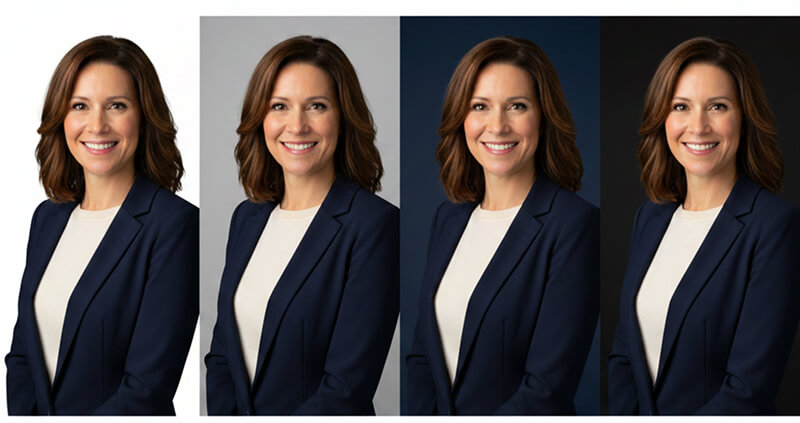
The Big Five: Background Colors That Work for 90% of Professionals
You don't need to choose from 50 shades of anything. Five colors handle nearly every professional situation. Here's each one, who should use it, and when to skip it.
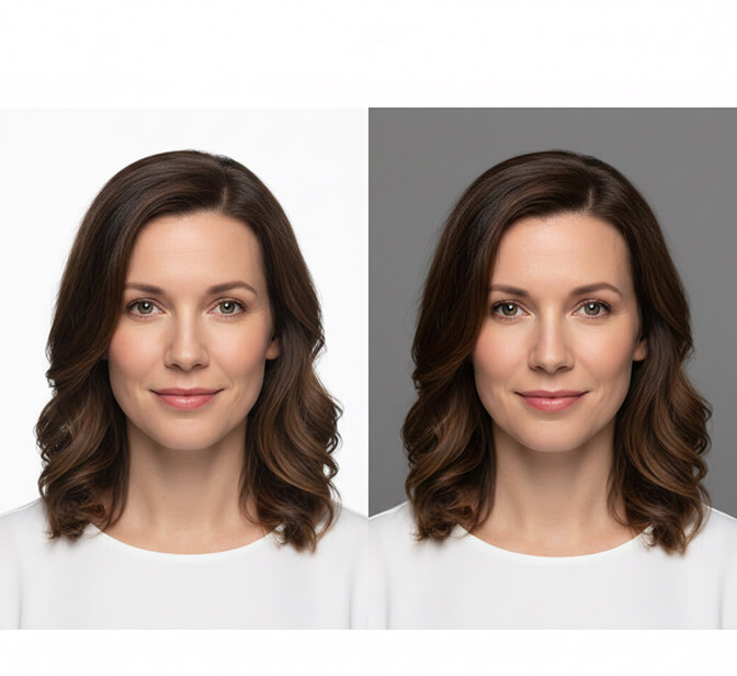
Light Gray: The Safest Bet in Professional Headshots
If you have no idea what color to choose, choose light gray. You will not regret it.
Light gray works with virtually every skin tone. It creates clean contrast without being harsh. It doesn't compete with your clothing. It photographs consistently well under different lighting conditions. And it looks polished on every platform.
Best for: Corporate professionals, finance, law, consulting, HR, operations, anyone updating their LinkedIn. Also the go-to for company team pages where everyone needs to match.
Skip it if: You want to stand out visually (gray is safe, but "safe" also means "forgettable" in a sea of gray LinkedIn headshots).
Light gray is also the most forgiving background for skin tone diversity. If your company is shooting team headshots for 50 people with different complexions and clothing choices, gray handles all of them gracefully.

White: Clean, Modern, and Trickier Than You Think
White is the second most popular headshot background color. It looks crisp, contemporary, and works beautifully for tech companies, healthcare professionals, and anyone who wants a minimalist aesthetic.
But here's the part nobody tells you.
White backgrounds can disappear on white websites. LinkedIn's desktop interface, most company "About Us" pages, and email clients all have white or near-white backgrounds. If your headshot also has a white background, there's no visual border. Your photo bleeds into the page. You lose the defined "photo" look and it starts to feel like a floating head.
Best for: Tech professionals, medical/healthcare, scientists, startups, anyone whose headshot will live on a colored website or printed materials.
Skip it if: Your headshot will primarily live on LinkedIn or white-background websites. Or if you have very light skin and light hair, which can wash out against pure white.
Pro tip: If you love the clean white look but worry about the LinkedIn problem, a very light gray (like 5-10% gray) gives you the white feel with just enough definition to hold its shape on any platform.

Dark Gray / Charcoal: Authority Without Drama
Dark gray is the corporate power move. It's serious without being dramatic. It commands attention without raising eyebrows.
The reason it works so well for executive headshots is contrast. Most professionals wear light or medium-toned clothing. Against a dark gray background, their face and outfit pop forward. The background recedes. Your eye goes straight to the face.
Best for: C-suite executives, attorneys, financial advisors, board members, anyone who needs to project authority and experience. Also excellent for professional headshot backgrounds on company websites with colored headers.
Skip it if: You're going for warm and approachable rather than authoritative. Dark backgrounds read as more serious and less casual.

Navy Blue: Trust in a Color
Now here's where color psychology actually earns its keep.
Blue genuinely does test well for perceived trustworthiness. Multiple studies have shown that blue backgrounds in professional photos increase trust ratings from viewers. This isn't just internet folklore. There's real data behind it.
Navy blue creates a rich, sophisticated backdrop that works across almost every industry. It's formal enough for finance and law but modern enough for tech and consulting. It photographs well with most skin tones. And it stands out on LinkedIn's white interface without being loud.
Best for: Financial services, consulting, real estate, insurance, anyone in client-facing roles where trust is the primary currency. Also surprisingly effective for LinkedIn profile photos because the color contrast is excellent on LinkedIn's light interface.
Skip it if: You work in healthcare (where white or light backgrounds are the norm) or in creative industries (where blue might feel too corporate).

Black: Bold, Dramatic, and Not for Everyone
A black background makes a statement. It's the headshot equivalent of walking into a room in a perfectly tailored black suit. Dramatic. Confident. Impossible to ignore.
The best black-background headshots use careful lighting to separate the subject from the darkness behind them. A rim light or hair light creates a subtle glow around the edges, preventing the "floating head in darkness" effect.
Best for: Creative directors, photographers, musicians, actors, executive coaches, public speakers, and anyone whose personal brand leans toward bold and distinctive.
Skip it if: You need to look warm and approachable. Black backgrounds read as confident and intense, which can feel intimidating in certain contexts. Also risky if you have very dark hair, as it can blend into the background without proper lighting.

What About Colored Backgrounds?
Here's where I'll be direct. Colored backgrounds (green, teal, blush pink, lavender, warm orange) can look incredible. But they're harder to get right, and they date faster.
A gray headshot from 2020 still looks perfectly current in 2026. A mint green background from 2020? It screams "pandemic-era Zoom vibes."
If you want color, here's my advice:
Muted, desaturated tones only. A dusty blue, a warm taupe, a soft sage. Not bright. Not neon. Not anything you'd see on a candy wrapper.
Match it to your brand. If your company's brand color is a specific blue, a background in that same family creates visual cohesion across your website and marketing materials.
Test it first. This is where AI headshot generators genuinely shine. Instead of committing to one background color in a studio and hoping it works, you can generate multiple versions with different backgrounds in minutes. Try them all. See which one feels right.
If you want to skip the guesswork entirely, Headshot Photo lets you choose from professional backgrounds and the AI builds your headshot with matched lighting and color balance. Ten minutes. Multiple options. No studio appointment.
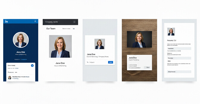
Picking Your Background by Platform
This is the part most guides miss entirely. Your background color should match where the headshot lives, not just who you are.
LinkedIn: Avoid pure white (disappears into the UI). Light gray, navy blue, or muted colors work best because they create a defined photo border in the feed. Your headshot is a tiny circle in most views, so high contrast is critical.
Company website: Match or complement the site's design. If the team page has a dark header, light backgrounds will pop. If the page is white, a gray or colored background gives each headshot a defined presence.
Email signature: Keep it simple. Light gray or white photographs cleanly at small sizes without looking muddy.
Business cards and print: Higher contrast works better in print than on screen. Dark backgrounds with light clothing, or light backgrounds with dark clothing, reproduce more reliably.
Resume / CV: White or light gray. Clean, traditional, no distractions.
The Skin Tone Factor (Simplified)
I could write 3,000 words on skin tone and background color matching. I'll give you the short version instead.
Fair skin: Avoid pure white backgrounds (you'll wash out). Light gray, soft blue, and muted warm tones create the best separation.
Medium skin: You have the most flexibility. Nearly any background works. Gray and blue are particularly flattering.
Dark skin: Avoid very dark backgrounds without careful lighting (your features can get lost). Light gray, white, and medium-toned colors create beautiful contrast and let your features shine.
Universal rule: If you can't decide, medium gray works for literally every skin tone on the planet. It's not the most exciting choice, but it's the most reliable.
For more on how clothing color interacts with backgrounds and skin tones, check out our guide on what colors to wear for headshots.
Why AI Makes the Background Color Decision Easier
Here's the reality of traditional headshot photography. You show up to the studio. The photographer has a gray backdrop. Maybe a white one too. You pick one. You shoot. You get the results a week later. If you don't like the background color, you're either paying for Photoshop work or booking another session.
With AI headshot generators like Headshot Photo, you upload a few selfies and the AI generates professional headshots across multiple background options. Different colors. Different styles. All with matched lighting and natural composition.
Want to see yourself against navy blue AND light gray AND white? Done. In minutes.
This isn't just faster. It's smarter. Because the truth is, you don't really know which background color works best for you until you see yourself against it. Theory only gets you so far. Actually seeing the comparison is what makes the decision obvious.

One Last Thing
A photographer I admire once told me something I've never forgotten:
"The best background is the one nobody notices."
He meant it as a compliment to simplicity. The background should support you, not compete with you. It should set the mood without stealing the spotlight. It should make the viewer look at your face and think, "I trust this person," without consciously registering why.
That's what a well-chosen headshot background color does. It works invisibly. It shapes perception without announcing itself. It's the unsung hero of every great professional headshot.
So pick your color. Make sure there's contrast. Match it to your profession and platform. And then forget about it.
Because at the end of the day, the background is just the frame.
You're the picture.
Frequently Asked Questions
What is the best background color for a professional headshot?
The best background color for most professionals is light gray. It works with virtually every skin tone, creates clean contrast with most clothing, and looks polished on every platform including LinkedIn, company websites, and business cards. Navy blue is a strong second choice for client-facing roles, as it subconsciously communicates trust and credibility.
How does a white headshot background compare to gray?
White backgrounds look clean and modern but can disappear on white websites like LinkedIn's desktop interface, creating a "floating head" effect. Gray provides similar cleanliness with a subtle border that holds its shape on any platform. If you love the white look, try a very light gray (5-10% gray) for the best of both worlds.
How do I choose a headshot background color for my skin tone?
Focus on contrast. Fair skin tones should avoid pure white (it washes you out) and lean toward light gray or soft blue. Dark skin tones should avoid very dark backgrounds without rim lighting. Medium skin tones have the most flexibility. When in doubt, medium gray works universally for every complexion. AI headshot tools like HeadshotPhoto let you test multiple colors instantly.
Is it worth paying extra for a custom background color in headshots?
With traditional photography, custom backgrounds can add $50-150 in setup or post-production costs. AI headshot generators include multiple background options in their standard pricing, which typically runs $15-45 total. If you want to test several colors before deciding, AI is significantly more cost-effective and faster than rebooking studio sessions.
Are colored backgrounds professional enough for corporate headshots?
Colored backgrounds can be highly professional when done correctly. The key is using muted, desaturated tones rather than bright or neon colors. Navy blue, dusty blue, warm taupe, and sage green all read as polished and intentional. Avoid trendy bright colors that may date quickly. Many Fortune 500 companies now use subtle brand-matched colored backgrounds for team headshots to create visual cohesion.
